

A conference room is where an organization makes its most consequential decisions, and too often it is also where those conversations quietly fall apart. The board chair dials in from an airport. The program manager at the far end of the table sounds like she is speaking from inside a culvert. Someone spends the first eight minutes hunting for the right cable. Nobody says it out loud, but everyone leaves a little less confident than they arrived.
The stakes are higher than they were a decade ago because the room now serves two audiences at once. As of August 2026, Gallup’s hybrid work indicator found that 54% of U.S. employees with remote-capable jobs work a hybrid schedule and another 25% work exclusively remote. In practice, that means a typical meeting includes people at the table and people on a screen, and the room has to work flawlessly for both.
There is also a credibility cost that most leaders never connect to the room itself. Researchers at USC and the Australian National University played the same scientific talks to listeners with good and degraded audio. When the sound was poor, participants judged the speakers as less intelligent and less likable and their work as less important, according to USC Dornsife’s summary of the study, published in Science Communication in 2018. As co-author Norbert Schwarz put it, “When you make it difficult for people to process information, it becomes less credible.” Your executives may be making a brilliant case in a room that is undermining them.
The good news is that great rooms are not a matter of luck or budget alone. They come from three decisions made together: layout, technology, and acoustics. Get one wrong, and the other two cannot compensate. This guide walks through each one, with the standards and field-tested details that separate a room people trust from a room people avoid. If you are planning a refresh now, our overview of boardroom and conference room AV solutions shows how these pieces come together in finished spaces.
What Should You Decide Before Designing a Conference Room?
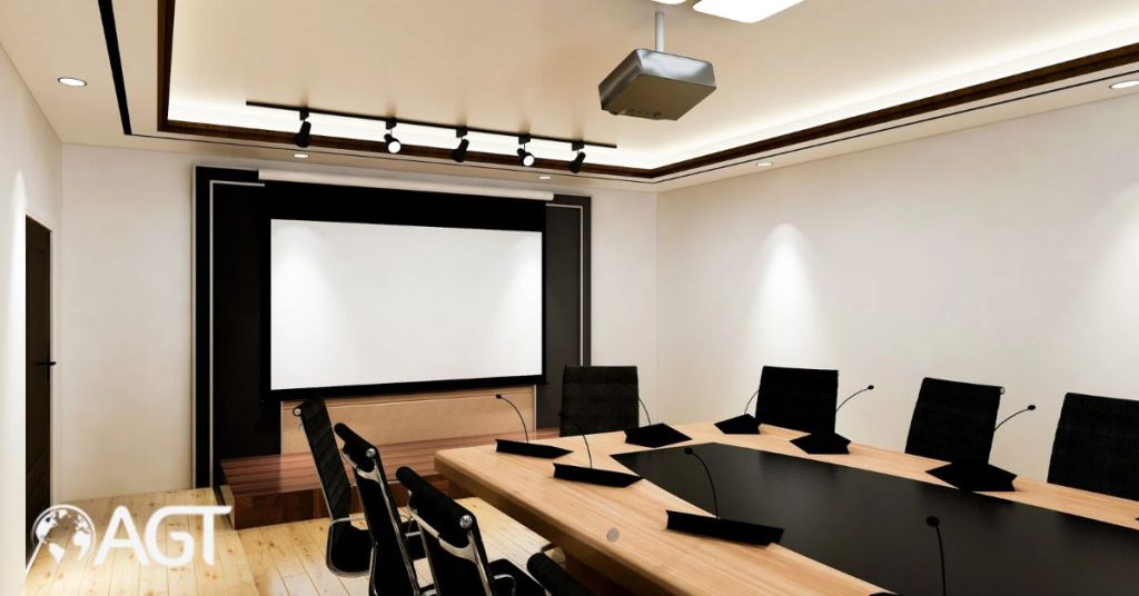
Decide what the room is for, who will use it, which platform it will run and who will support it after launch. Product choices come last. Teams that start with a catalog usually end up with a room that is technically impressive and practically frustrating.
Start with evidence rather than assumptions:
1. Pull your booking data.
Compare average attendance with seat count. Many organizations discover they are reserving 12-seat rooms for three-person calls while small rooms sit in short supply.
2. Name the dominant meeting type.
A room built for decision-making with clients needs different sightlines and audio coverage than one built for workshops or training.
3. Pick a platform standard.
Rooms run best when they are built around one native experience, such as Microsoft Teams Rooms or Zoom Rooms, with a clear plan for joining other platforms as a guest.
4. Classify the conversations.
Will this room host personnel matters, patient information, or sensitive program discussions? That answer drives wall construction, network design, and device policy long before anyone chooses a display.
5. Assign day-two ownership.
Somebody has to patch firmware, answer the “it won’t connect” call at 7:55 a.m. and plan the refresh. Decide who before the room opens.
This is the stage where a disciplined audio-visual design process pays for itself. A good design team documents requirements, sightlines, cable paths, acoustic targets, and support expectations on paper, where changes cost almost nothing. If you want a sense of what that work looks like from kickoff to commissioning, this walkthrough of an AV design engineer’s role throughout a project is a useful primer.
How Big Should a Conference Room Be?
Plan on roughly 25 to 30 square feet per seated person, plus about 3 to 4 feet of clearance behind chairs so people can pass a seated row. Then size the room to how it is actually used, not to the largest meeting anyone can imagine.
The planning ranges below are the starting points most design teams use. They are not code requirements, and your final dimensions should follow the layout, display size and local building rules.
What Is the Best Conference Room Layout for Hybrid Meetings?
For most hybrid meetings, the best layout is a trapezoid or V-shaped table that opens toward a single “front wall” holding the display and an eye-level camera. Every seat faces the screen, and every face faces the remote participants.
The classic long boardroom table looks commanding in a photo, but it was designed for a world where everyone was in the room. On camera, the people at the far end shrink to a few pixels and the people along the sides appear in profile. Remote attendees end up watching the backs of heads and guessing who is talking.
A few layout rules hold in nearly every room:
• Establish a true front of room. The display, camera, power, and lighting zones all orient to it. Rooms with two competing “fronts” confuse both people and cameras.
• Keep the display off the window wall. Daylight behind a screen washes out content and turns faces into silhouettes.
• Protect the turning angle. If people have to twist sharply in their chairs to see the screen, they stop looking at it.
• Put writable surfaces where the camera can see them. A whiteboard the remote team cannot read is a whiteboard that excludes half the meeting.
• Choose matte finishes. Glossy tabletops create glare on camera and reflect sound toward the microphones.
If you are rethinking an executive space, this piece on AV integration in boardroom transformations shows how layout and technology decisions shape one another at the leadership level.
How Big Should a Conference Room Display Be?
A conference room display should be sized for the person in the farthest seat and for the smallest thing they need to read, not for the width of the wall. The industry standard for doing that is AVIXA’s Display Image Size for 2D Content (DISCAS).
For years, integrators leaned on simple multipliers that tied screen height to viewing distance. AVIXA’s DISCAS standard, first published in 2016 and since updated, replaced that guesswork with a method grounded in human visual acuity. It recognizes two very different viewing tasks:
1. Basic decision making.
Viewers need to read and understand content, such as a slide or a spreadsheet, without seeing every pixel. Here the question is how tall the smallest meaningful element, usually a line of text, must be relative to the image for the farthest viewer to read it.
2. Analytical decision making.
Viewers must see fine detail, such as an engineering drawing, a medical image or a dense intelligence map. Here the standard ties image height directly to resolution and distance.
The analytical formula holds a surprise for anyone shopping by resolution. Image height equals the farthest viewing distance multiplied by the image’s vertical resolution, divided by an acuity factor of 3438. A viewer 22 feet away who needs to resolve every pixel of a 1080p image requires an image about 6.9 feet tall. Switch that content to 4K and the required height doubles to roughly 13.8 feet. A sharper panel does not let people at the back see more detail unless the image grows with it. You can run your own room’s numbers with AVIXA’s free DISCAS calculator.
Most corporate meetings fall under basic decision-making, which is why content discipline matters as much as hardware. Larger fonts and simpler slides can rescue a room where the display is slightly undersized. For a deeper look at the tradeoffs, see this comparison of 2K versus 1080p for conference rooms and this overview of advanced meeting room displays.
A few practical rules round out the decision. Mount the screen so its bottom edge sits near seated eye height, which spares necks during long meetings. In larger rooms, use two displays so remote participants and shared content each get full-size space. Once an image needs to exceed what a single flat panel offers, consider direct-view LED or a projection system rather than tiling consumer screens.
Where Should the Camera and Microphones Go in a Conference Room?
Put the camera at seated eye level on the same wall as the display, centered on the table, and place microphones so every talker is close to one. Then let digital signal processing handle echo cancellation, noise reduction and level control so the far end hears a clean, consistent voice.
1. Cameras
The most common camera mistake is mounting it high above a large display, which gives remote viewers a security-footage angle looking down on the tops of heads. A camera at or just above the bottom edge of the screen keeps eye lines natural. For small rooms, an all-in-one video bar with a wide lens is often enough. Medium rooms benefit from intelligent framing that zooms to whoever is speaking or shows each participant in a separate tile. Boardrooms and training rooms often need multiple cameras with speaker tracking so the remote audience sees the person talking, not a wide shot of the entire table. This guide to choosing the best camera for video conferencing breaks down the options by room size.
2. Microphones
Audio is where conference rooms most often fail, and it is the failure remote participants notice first. The guiding principle is simple: the closer the microphone is to the mouth, the less room noise and reverberation it captures. Tabletop microphones work well when they are within comfortable reach of every seat. Beamforming ceiling arrays keep tables clear and steer pickup toward active talkers, but they depend heavily on good room acoustics to perform. Laptop microphones in a shared room are a recipe for echo and feedback, which is why well-run rooms ask anyone joining from a laptop to leave their audio off.
3. Speakers
Place them at the front of the room near the display so voices seem to come from the faces on screen. Larger rooms may need distributed ceiling speakers to keep levels even from the first seat to the last.
4. Control and connectivity
The best room is one nobody has to think about. Aim for one-touch join from the calendar invite, wireless content sharing, a wired USB-C or HDMI fallback at the table, and a single touch panel instead of a basket of remotes. Our explainer on the future of AV control systems covers how modern control platforms simplify that experience, and the principles behind clear speech pickup are covered in more depth in audio design principles for immersive experiences. For organizations standardizing across many rooms, a coordinated video collaboration strategy keeps every space behaving the same way.
How Do You Reduce Echo and Keep a Conference Room Private?
You reduce echo by absorbing sound on the ceiling and walls, and you protect privacy by blocking sound with properly built walls, doors, and ceilings. Acoustic treatment is the least glamorous line in a conference room budget and the one that most often decides whether the expensive technology works.
The U.S. General Services Administration says it plainly in Sound Matters, its guide to acoustic comfort in federal offices: acoustic underperformance is the greatest source of occupant dissatisfaction, and acoustics must be considered at the start of design rather than fixed afterward. The guide organizes the work into three moves: absorb, block, and cover.
1. Absorb to control echo
Hard surfaces such as glass, drywall, and concrete bounce speech around the room. People at the table hear a muddy voice, and remote participants hear it even more poorly because the microphone picks up every reflection. GSA recommends ceilings rated at least NRC 0.8 in meeting rooms, plus absorptive wall panels of at least NRC 0.8 on 25% of the walls. Placement matters as much as quantity. Panels at seated head height on parallel walls stop the rapid “flutter echo” that bare rooms produce.
2. Block to protect privacy
Here, GSA’s recommended wall ratings are specific: STC 45 or better for conference rooms that require confidential speech privacy, and STC 53 or better for video conference and training rooms.
3. Cover to steady the background
Sound masking is best used in the open office, outside the room, where a steady, unobtrusive background makes conversations leaking from meeting spaces harder to hear.
The targets below summarize GSA’s guidance for two common room types.
The WELL Building Standard sets a similar limit for reverberation, capping conference rooms at 0.6 seconds in its reverberation time feature.
Several findings buried in the GSA guide are worth sharing with any project team:
• Lab ratings are not field results. A wall’s STC rating comes from a laboratory. Its installed performance, measured as NIC, can fall 10 points or more below that rating because of poor detailing. GSA recommends requiring the installer to test partitions after construction.
• Walls that stop at the drop ceiling leak. Sound travels over the top through the plenum. Confidential rooms need full-height walls sealed to the structure above.
• A closed door is not a private room. Sliding and pivot glass doors seal poorly. Solid-core hinged doors with perimeter gaskets and a bottom seal perform far better.
• Distance is a weak defense. Doubling the distance between talker and listener lowers the level by only about 5 decibels, which is barely perceptible.
• Plants are decoration, not acoustics. It would take a jungle to absorb meaningful sound.
Glass-walled rooms deserve special mention because they are popular and acoustically unforgiving. If transparency is a design priority, compensate with heavy absorption on the ceiling and opposite walls and with laminated or double glazing. For a broader primer, see what acoustics means in commercial audio visual design and the role of acoustics in Zoom Room design.
Privacy is not only a comfort issue. GSA notes that speech privacy, meaning speech that casual listeners cannot understand, is the foundation of enforcement procedures under privacy laws such as HIPAA. That is one reason healthcare AV environments and government AV spaces treat wall construction as part of their compliance posture, not an interior design choice.
What Lighting Works Best for Video Calls in a Conference Room?
The best conference room lighting is soft, even light that falls on people’s faces from the front, at one consistent color temperature, with daylight under control. Remember that the camera is now one of your most important attendees, and it sees light very differently than the human eye.
Office lighting was traditionally designed to illuminate desks, so most fixtures point straight down. That works for reading paper and fails on video. Downlights directly over the table carve dark shadows under brows and noses, and remote participants see a row of tired, hollow-eyed colleagues. Video-friendly rooms add diffuse light on the vertical plane where faces are, often from fixtures in front of the table or wall washers on the camera wall.
A few details make an outsized difference:
1. Tame the windows.
A bright window behind the participants forces the camera to expose for the glare, which turns faces into silhouettes. Shades or blinds that people actually use are essential.
2. Keep color temperature consistent.
Mixing warm and cool sources makes skin tones look uneven on camera and gives image processing nothing stable to work with.
3. Create scenes, not switches.
Presets for video calls, presentations and open discussion let anyone set the room correctly with one press.
4. Choose the back wall carefully.
Medium-toned, matte finishes flatter faces. Busy patterns, pure white walls and glossy surfaces confuse cameras and distract viewers.
Lighting is also where aesthetics and engineering meet most visibly. This article on balancing aesthetics and functionality in AV design explores how to get a room that looks good in person and on screen.
How Do You Make a Conference Room Accessible?
An accessible conference room gives every participant an equal way to get in, sit at the table, see the content, hear the discussion and operate the technology. Start with the physical requirements in the ADA Standards, then extend the same thinking to audio, video and controls.
The physical baseline is well defined. Where accessible work surfaces are required, the 2010 ADA Standards call for tops between 28 and 34 inches above the floor, with clear floor space for a forward approach and knee and toe clearance underneath, as set out in Chapter 9 of the ADA Standards published by the U.S. Access Board. In practice, that means confirming that the table base, pedestal legs or built-in power modules do not block a wheelchair user from pulling up to at least some seats. Keep circulation paths around the table clear, too. A room that is accessible on the floor plan can become inaccessible once extra chairs are crammed in.
The technology layer is where many rooms fall short:
1. Hearing
Assistive listening systems, such as induction loops or infrared and RF receivers, help participants with hearing loss. Signage should make it obvious that the system exists. GSA’s acoustic guidance also notes that designing for speech intelligibility serves people who are hard of hearing, so the absorption work described above doubles as an accessibility measure.
2. Seeing
Live captions on the room display help people who are deaf or hard of hearing, non-native speakers and anyone sitting in the back. High-contrast interfaces and large text on touch panels help users with low vision.
3. Operating
Touch panels, light switches and power outlets should be within reach from a seated position. A room that requires someone to stand and reach behind a credenza to share content is not truly accessible.
4. Focusing
Glare, flicker, background noise and visual clutter disproportionately affect neurodivergent participants. A calm, well-treated room is an inclusive room.
Accessibility also extends to remote participants. Equal sightlines, clear audio and a whiteboard everyone can read are as much about inclusion as about convenience.
What Should a Conference Room Design Checklist Include?
A useful conference room checklist covers purpose, layout, display, audio, acoustics, lighting, accessibility, security and support. Walk any existing room with this list, or hand it to your project team before design begins.
• Room purpose and typical headcount confirmed with booking data
• Room size and proportions fit the seat count and the layout
• A clear front of room, with the display away from windows
• Display sized for the farthest viewer using the DISCAS method
• Camera at seated eye level, covering every seat
• Microphone coverage for every talker, with echo cancellation tuned
• One-touch join, wireless sharing and a wired fallback tested
• Ceiling and wall absorption in place and reverberation verified
• Full-height walls and sealed doors where privacy matters, with installed performance tested
• Even, front-facing light on faces and controllable shades
• Accessible seating, reachable controls, captions and assistive listening
• Room devices on a segmented network with patching and monitoring
• A named support owner, a response plan and a refresh schedule
Who Should Design and Support Your Conference Room?
Choose a partner that will own the outcome for the life of the room, not just the installation day. For high-stakes environments, the right integrator brings certified engineering, security awareness and a proven support model, and it stays accountable when something goes wrong at 7:55 a.m. before a board meeting.
That is the standard Applied Global Technologies has built its reputation on for more than 30 years. Our teams hold more than 50 industry-recognized certifications, have served more than 40 Fortune 100 clients and have completed more than $210 million in government contracts. We design and deliver audio visual integration for conference rooms, boardrooms, command centers, courtrooms and clinical spaces, and we stay engaged afterward with proactive monitoring and 24/7 response when uptime cannot wait. You can see how that approach plays out in our proven capability and in our client case studies.
If you are comparing providers, this guide to choosing the right AV integrator for your business outlines the questions worth asking. When you are ready to plan a room that simply works, meeting after meeting, talk with our team.
FAQs
What size conference room do you need for 10 people?
At roughly 25 to 30 square feet per seated person, a 10-person conference room needs about 250 to 300 square feet. Allow extra depth for chair clearance and the display wall, so many teams land closer to 300 to 350 square feet.
What is the difference between a huddle room and a conference room?
A huddle room seats two to six people in about 100 to 150 square feet and is built for quick, informal calls, usually with an all-in-one video bar. A conference room hosts larger, scheduled meetings and needs a bigger display, broader microphone coverage and more deliberate acoustic treatment.
How do you reduce echo in a conference room without renovating?
Add high-NRC ceiling clouds or tiles and fabric-wrapped wall panels at seated head height, focusing on walls that face each other. Rugs, upholstered seating and drapes over glass help further, but they cannot replace treatment on the ceiling.
Do glass conference rooms have bad acoustics?
Glass reflects sound and often seals poorly around doors and frames, so glass rooms tend to echo and leak conversation. They can perform well when paired with heavy ceiling absorption, laminated or double glazing and gasketed solid doors.